

Real-Time Messaging Made Easy: Build iOS Chat App with QuickBlox UI Kit
A step-by-step guide for getting started with the QuickBlox Chat UI for iOS


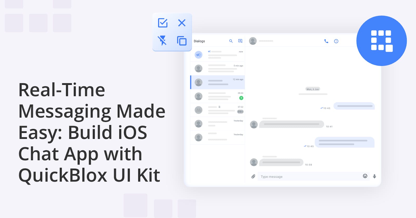
Hey, fellow developers! If you’re looking to build a real-time messaging app for iOS then you need to check out our awesome tutorial below
Say hello to QuickBlox UI Kit, your new best friend in building real-time chat functionality into your apps. 🎉 Whether you're dreaming of creating a social networking app, a support platform, or any app that needs instant messaging, QuickBlox has got your back! We've got it all covered, step-by-step, so you'll be slinging messages back and forth in no time. We’ll even show you how to customize your app's color scheme! 🎨💡 Get ready to make your app look sleek and on-brand, ready to woo your users with that personal touch!
Step 1: Meet your new best friend, QuickBlox
QuickBlox is a versatile communication platform that empowers developers to effortlessly integrate real-time chat functionality into their applications. Their new UI Kits greatly expedite the app development process by providing ready-to-use components.
To get started on this project, first, you'll need a trusty QuickBlox account to unlock the wonders of the QuickBlox iOS UI Kit. Don't have one yet? No worries, it's a breeze to get started! Simply hop over to the QuickBlox website or register for an account here.
Check out our earlier blog post titled "How to Create an App and Use the QuickBlox Admin Panel." This gem of a guide will walk you through the whole process of setting up and accessing your App credentials in the QuickBlox Admin Panel. Trust us, you'll need those credentials to work some real magic in Step 3 of this guide! 🧙♂️
Step 2: Create a brand-spanking new iOS SwiftUI project
Now that you've got your QuickBlox account ready to roll, let's dive into the fun part – creating a sizzling hot iOS SwiftUI project using Xcode! 🔥
First things first, let's fire up Xcode on your Mac. Boom! 🚀
You'll see some options. We want to get started with a brand-new project, so, either click on "Create a new Xcode project" or head to File > New > Project.
The template selection screen awaits your creative genius! Among the choices, find the "App" option under the "iOS" tab.
Enter a Product Name for your project and choose an Organization Identifier. Let's make this app stand out! 🌟
Just like a dream team, every app needs a signature. Select a Team to sign your app and let it shine with that official seal! ✨
We're all about SwiftUI here, so make sure to pick "SwiftUI" as the User Interface option and tap the "Next" button.
Last but not least, choose the desired location to save your project, and with a confident click on "Create," we've officially made some real progress! 🏆
Step 3: Time to Spice Things Up with QuickBlox iOS UI Kit! 🚀
Now that you've got your super cool iOS SwiftUI project all setup, it's time to kick things up a notch by integrating the QuickBlox iOS UI Kit into your app. 🎉 This kit comes as a Swift Package, which means we've got a smooth ride ahead in adding it to our project. Ready? Let's roll! 😉
First, pop open that Xcode and double-click on the .xcodeproj file to get our project up on the big screen. Now, take a glance at the project navigator (you'll find it usually in the left sidebar).
Right-click on the folder that represents your project, and choose "Swift Packages" > "Add Package Dependency."
A dialog will appear. Type in the URL for the QuickBlox iOS UI Kit Swift Package, which you can find at https://github.com/QuickBlox/ios-ui-kit. Easy peasy, right?
Click "Next" and pick your desired version or branch of the Swift Package. And hey, if you're feeling picky, you can even specify a version requirement.
Drumroll, please! 🥁 Xcode will do its thing, and ta-da! A confirmation dialog appears, ready to give you the good news. Just make sure your main target is selected in the "Add to" dropdown (don't leave it hanging!), and with a final flourish, click on "Finish." 🎊
Step 4: Let's Get the QuickBlox SDK Rolling!
Now that we've got the QuickBlox iOS UI Kit snugly nestled into our app, it's time to give the QuickBlox SDK a warm welcome too! 🎉 Initializing the SDK is all about getting it ready to play its part in our awesome development environment.
To get the SDK up and running, we'll need a set of special credentials: the Application ID, Authorization Key, Authorization Secret, and Account Key. Don't worry, you can easily get your hands on these credentials from the QuickBlox Admin Panel. If you're not sure how to do that, no sweat! Just re-check the tutorial, "How to Create an App and Use the QuickBlox Admin Panel," and we'll guide you through the whole process step by step! Easy peasy! 😉
Here’s an example of the initialization code:
import Quickblox
// ...
func initializeQuickBloxSDK() {
    let applicationID: UInt = "Your_Application_ID"
    let authKey = "Your_Authorization_Key"
    let authSecret = "Your_Authorization_Secret"
    let accountKey = "Your_Account_Key"

    Quickblox.initWithApplicationId(applicationID,
                                    authKey: authKey,
                                    authSecret: authSecret,
                                    accountKey: accountKey")

                                    }

// Call the initialization method somewhere in your application setup process
initializeQuickBloxSDK()
Don’t forget to replace the placeholder values with your actual credentials.
Step 5: Authenticate and Chat Away!
Hey, we're almost there! But before we unleash the chatting awesomeness, we need to make sure our users are properly authenticated within the QuickBlox system.
QuickBlox has got your back with various authentication methods, and guess what? We've got all the juicy details in our official documentation.
But hey, no need to feel overwhelmed. Let's kick things off with a super cool example using a login and password for user authentication. The quicker we get this step done, the sooner we'll be sending those first chat messages like pros! 💬🤩
import QuickBloxUIKit
import Quickblox
struct ContentView: View {
    @State private var isPresented = false
    var body: some View {
        Button("Present!") {
            authenticateUser()
        }
        .fullScreenCover(isPresented: $isPresented) {
            // show Dialogs screen
            QuickBloxUIKit.dialogsView()
        }
    }
    func authenticateUser() {
        QBRequest.logIn(withUserLogin: "userLogin",
                        password: "userPassword",
                        successBlock: { (response, user) in
            // Block with response and user instances if the request is succeeded.
            self.isPresented.toggle()
        }, errorBlock: { (response) in
            // Block with response instance if the request is failed.
        })
    }
}
By calling authenticateUser(), users will be magically authenticated using their login credentials. And when that authentication request succeeds, we'll wave our wand and toggle the isPresented state variable! Prepare to be amazed as the sparkling Dialogs screen appears, thanks to the fantastic QuickBloxUIKit. It's coding magic at its finest! 🧙♂️💫
Congratulations 🎉🎉 You've conquered the initial steps to get started with the incredible UI Kit!
Step 6: Customized color magic! ✨
As a top-notch developer, you know the secret sauce to a successful app lies in a captivating user experience. When users find an app that's visually stunning and easy on the eyes, they're hooked! 🌟 They'll not only keep coming back for more, but they'll also be spreading the word to all their friends!
The QuickBlox iOS UI Kit comes with a default color theme, all set with its Light and Dark flavors. But the Kit also allows you to create your very own color palette if you so desire.
Using the UIKitSample
We recommend downloading our UIKitSample where we've already implemented the color theme customization steps and added some awesome examples! 🎨✨ In this sample, we've already got the QuickBlox iOS UI Kit connected as a Swift Package, so you can dive right into the fun stuff! You can even allow your app users to choose their favorite color scheme. How cool is that? 😍 Just pay attention to one of the options for implementing this feature in our UIKitSample.
Customizing within your iOS SwiftUI project
Before we show you how to customize your color scheme within your iOS Swift project let's first start by getting familiar with the default color theme of QuickBlox UIKit.
public class ThemeColor: ThemeColorProtocol {
    public var mainElements: Color = Color("MainElements", bundle: .module)
    public var secondaryElements: Color = Color("SecondaryElements", bundle: .module)
    public var tertiaryElements: Color = Color("TertiaryElements", bundle: .module)
    public var disabledElements: Color = Color("DisabledElements", bundle: .module)
    public var mainText: Color = Color("MainText", bundle: .module)
    public var secondaryText: Color = Color("SecondaryText", bundle: .module)
    public var caption: Color = Color("Caption", bundle: .module)
    public var mainBackground: Color = Color("MainBackground", bundle: .module)
    public var secondaryBackground: Color = Color("SecondaryBackground", bundle: .module)
    public var tertiaryBackground: Color = Color("TertiaryBackground", bundle: .module)
    public var incomingBackground: Color = Color("IncomingBackground", bundle: .module)
    public var outgoingBackground: Color = Color("OutgoingBackground", bundle: .module)
    public var dropdownBackground: Color = Color("DropdownBackground", bundle: .module)
    public var inputBackground: Color = Color("InputBackground", bundle: .module)
    public var divider: Color = Color("Divider", bundle: .module)
    public var error: Color = Color("Error", bundle: .module)
    public var success: Color = Color("Success", bundle: .module)
    public var highLight: Color = Color("HighLight", bundle: .module)
    public var system: Color = Color("System", bundle: .module)

    public init() {}
}
This theme follows the ThemeColorProtocol protocol, which ensures all the required colors are in perfect harmony to showcase a stunning UI. 🌈
The Light and Dark schemes are configured using Color Sets right in Xcode. If you're not yet familiar with Color Sets and how to make the most of them in your app, check out the details in the documentation straight from Apple themselves.
Create your color scheme
Let's create a MyAmazingColorTheme class that conforms to QuickBloxUIKit.ThemeColorProtocol and initialize it with our own personalized colors:
class MyAmazingColorTheme: ThemeColorProtocol {
    var mainElements: Color = Color(uiColor: UIColor { traitCollection in
        traitCollection.userInterfaceStyle == .dark ? UIColor.blue
        : UIColor.cyan
    })

    var secondaryElements: Color = Color(uiColor: UIColor { traitCollection in
        traitCollection.userInterfaceStyle == .dark ? UIColor(hex: "#3978FC")
        : UIColor(hex: "#74A1FD")
    })

    var tertiaryElements: Color = Color.black
    var disabledElements: Color = Color.black.opacity(0.5)

    var mainText: Color = Color("Your_MainText")
    var secondaryText: Color = Color("Your_SecondaryText")
    var caption: Color = Color("Your_Caption")
    var mainBackground: Color = Color("Your_MainBackground")
    var secondaryBackground: Color = Color("Your_SecondaryBackground")
    var tertiaryBackground: Color = Color("Your_TertiaryBackground")
    var incomingBackground: Color = Color("Your_IncomingBackground")
    var outgoingBackground: Color = Color("Your_OutgoingBackground")
    var dropdownBackground: Color = Color("Your_DropdownBackground")
    var inputBackground: Color = Color("Your_InputBackground")
    var divider: Color = Color("Your_Divider")
    var error: Color = Color("Your_Error")
    var success: Color = Color("Your_Success")
    var highLight: Color = Color("Your_HighLight")
    var system: Color = Color("Your_System")

    init() {}
}
Check out all these cool ways to set colors in your app! We've got options to cover all your needs, so you can pick the one that suits you best! Let's take a look:
1. Keeping things simple, we've got a constructor that sets colors for both Light and Dark schemes.
var mainElements: Color = Color(uiColor: UIColor { traitCollection in
        traitCollection.userInterfaceStyle == .dark ? UIColor.blue
        : UIColor.cyan
    })
2. In this version, we use the same constructor as above, but we've spiced things up with a UIColor extension to make it super convenient to use Hex Strings!
var secondaryElements: Color = Color(uiColor: UIColor { traitCollection in
           traitCollection.userInterfaceStyle == .dark ? UIColor(hexRGB: "#3978FC") ?? UIColor.white
           : UIColor(hexRGB: "#74A1FD") ?? UIColor.black
    })
And this is an extension for UIColor:
extension UIColor {
    convenience init?(hexRGB: String, alpha: CGFloat = 1) {
        var chars = Array(hexRGB.hasPrefix("#") ? hexRGB.dropFirst() : hexRGB[...])
        switch chars.count {
        case 3: chars = chars.flatMap { [$0, $0] }
        case 6: break
        default: return nil
        }
        self.init(red: .init(strtoul(String(chars[0...1]), nil, 16)) / 255,
                green: .init(strtoul(String(chars[2...3]), nil, 16)) / 255,
                 blue: .init(strtoul(String(chars[4...5]), nil, 16)) / 255,
                alpha: alpha)
    }
}
3. Now, for those who prefer simplicity without automatic color switching between Light and Dark schemes, we have the default constructor option.
var tertiaryElements: Color = Color.black

var disabledElements: Color = Color.black.opacity(0.5)
4. If you want to stick to the tried-and-true method, we've got you covered! We set colors using Color Sets, just like the default color theme we mentioned earlier. Colors will change between Light and Dark schemes.
var mainText: Color = Color("Your_MainText")

var secondaryText: Color = Color("Your_SecondaryText")
There are still more options.
Picture your app with these amazing color options, customized to perfection just for you! 🎉🚀 Feel free to mix and match – the possibilities are endless! Let your creativity shine through, and your app will look stunning with your choice of colors!
Apply your color Scheme
Now that you've crafted your very own color theme, it's time to make it shine in the world of QuickBlox iOS UI Kit! To make it happen, we'll create a special class called MyAmazingTheme that perfectly corresponds to QuickBloxUIKit.ThemeProtocol. This class obliges us to do initialization with ThemeColorProtocol, ThemeFontProtocol, and ThemeImageProtocol. ✨🎵
class AppTheme: ThemeProtocol {

var color: ThemeColorProtocol

var font: ThemeFontProtocol

var image: ThemeImageProtocol

init(color: ThemeColorProtocol,

font: ThemeFontProtocol,

image: ThemeImageProtocol) {

self.color = color

self.font = font

self.image = image

}
}
Next, we create an object of this class:
var appTheme: AppTheme = AppTheme(color: MyAmazingColorTheme(),

                          font: QuickBloxUIKit.ThemeFont(),

                         image: QuickBloxUIKit.ThemeImage())
Congratulations! You have successfully customized the color theme of the QuickBlox iOS UI Kit in your app.
Almost there, my friend! 🌟 Now it's time to bring your theme to life and install it in your app. It's totally up to you where you want to do this – find a cozy spot that feels just right! 🎨💻 Perhaps at the entry point to the QuickBlox iOS UI.
Wrapping up
Congratulations on completing this journey through the QuickBlox UI Kit! You’ve learned how to set up the UI Kit and start to customize, allowing you to create captivating chat interfaces that engage users like never before.
Watch out for future tutorials that will share more tips and guidance for making the most out of the iOS UI Kit.
Join the QuickBlox Dev Discord Community! Share ideas, learn about software, and get support.